Office teams experience a company's brand in a particular way. They sit inside it. The logo is on the wall, the colour scheme is in the fit-out, the branded stationery is on the desk. Brand presence is almost ambient; it surrounds the environment without requiring much deliberate effort to maintain.
Field teams experience it differently. A site manager, a tradesperson, a project engineer, or a crew working across multiple locations doesn't spend their day in a branded environment. They move between sites, vehicles, storage areas, and outdoor spaces where the company's visual identity is largely absent unless it has been deliberately placed on the products they carry and use every day.
This is the gap that practical branded merchandise closes. Not as a substitute for workwear or signage, but as the layer of brand presence that travels with the person through the commute, across the jobsite, and into every client-facing moment the working day produces.
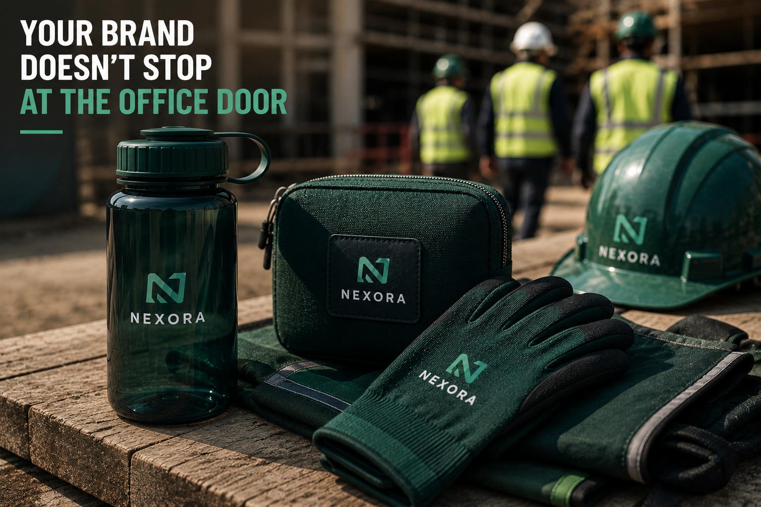
Three products illustrate this clearly.
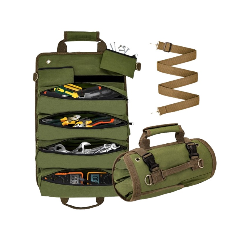
A canvas zipper pouch.
A lightweight Tritan water bottle.
A pair of branded safety gloves.
Used individually, each carries the brand in a specific context. Combined in a consistent colourway with considered logo placement, they create something more cohesive a coordinated visual identity that moves wherever your team does.
The Canvas Zipper Pouch: A Brand Surface That Goes Everywhere
A canvas zipper pouch is not a glamorous product. It holds things. Small tools, fasteners, adapters, cables, personal items and the miscellaneous essentials that a working person accumulates and needs to keep organised across a day that involves multiple locations and tasks.
That is precisely why it is such an effective brand carrier. Getting the welcome experience right at scale, consistently, across a large and growing workforce, is something well-chosen branded merchandise handles quietly and effectively. A canvas zipper pouch does this in a specific way: it earns its place in the bag, the tool kit, or on the workbench through genuine usefulness, and it stays there. Unlike products that get used once and put aside, a well-made pouch becomes a daily fixture which means the brand on it becomes a daily fixture too.
The specification decisions that make the difference here are straightforward but important. Canvas weight determines how the pouch holds up over time, a heavier GSM canvas maintains its structure through repeated use and survives the kind of treatment a working environment involves. Zipper quality determines whether the pouch is trusted with anything valuable, or relegated to less important contents. And logo placement determines whether the brand feels considered or incidental.
A tonal embroidered logo on a structured canvas pouch, in the company's primary colour, communicates something that a screen-printed logo on thin fabric does not. It communicates that the product itself was thought about and by extension, that the company behind it thinks carefully about what it puts its name on.
For field teams, this matters. New hires who receive a complete, branded kit on day one show up to their first shift already looking like part of the team. The pouch is one component of that kit small in isolation, more significant as part of a coordinated set.
The Lightweight Tritan Water Bottle: Repeated Visibility Across the Full Day
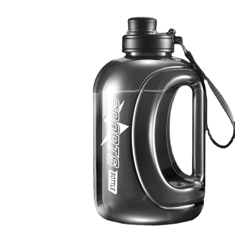
A water bottle travels further than almost any other branded product. It goes from home to vehicle to site to break room and back again. It is handled multiple times every hour. It sits on desks, benches, scaffolding platforms, and dashboards. It is one of the few products that genuinely accompanies a person through the entirety of their working day and often beyond it.
Tritan is the material of choice for a construction or field-team context for specific reasons. It is lightweight enough that carrying it adds nothing meaningful to the load a working person already manages. It is durable enough to survive being knocked off surfaces without cracking. It is BPA-free, which has become a baseline expectation for any water bottle given to employees in a professional context. And it is clear enough, in most formulations, to allow liquid level to be seen at a glance a practical detail that matters on site.
Construction workers need hydration solutions that survive being knocked off scaffolding and keep drinks cold through summer heat. A Tritan bottle addresses the survival requirement directly. The thermal performance can be enhanced through wall construction choices a double-wall design adds insulation without significantly increasing weight or cost.
The brand opportunity in a water bottle lies in how the logo is applied and how the colour is chosen. A bottle in the company's brand colour, with a logo applied through pad print or laser engraving rather than a basic decal, is a product that looks deliberate. It looks like it belongs to a coordinated set which, when paired with the pouch and the gloves in the same colour palette, it does.
This consistency is what separates a branded water bottle from a practical gift and turns it into a piece of brand infrastructure. The bottle becomes part of how the team looks when they show up on site. And how a team looks on site is part of how the company is perceived by clients, subcontractors, and anyone else passing through.
Safety Gloves: The Small Visual Detail That Completes the Look
Branded safety gloves are not the first product most companies think of when planning field-team merchandise. They should be reconsidered.
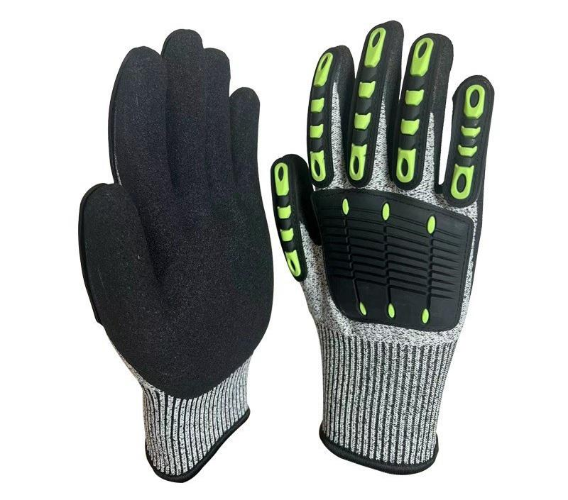
Gloves are used on site constantly handling materials, operating equipment, moving between tasks. They are visible at close range, which makes them an effective brand surface in client-facing moments. A site visit, a project handover, a client walkthrough these are moments when the crew's appearance contributes directly to the client's impression of the company, and gloves are part of that appearance.
Customisable safety gear including gloves helps companies make sure their brand is seen and appreciated right on the job site. A logo on a glove cuff, in the company colour, adds a detail that is small individually and coherent collectively. It is the kind of detail that clients notice without necessarily articulating the sense that this crew is put-together, that the company has thought about how its people present themselves in the field.
The specification considerations for branded safety gloves are practical. Glove type should match the actual work being done; a light-duty assembly glove is not appropriate for heavy material handling, and specifying the wrong protection level creates a compliance problem rather than a brand opportunity. The branding method needs to be durable enough to survive the working life of the glove; embroidery at the cuff is more robust than print, and colour-matched stitching is more considered than a contrasting logo that draws attention to itself. The fit range matters too; a branded glove that doesn't fit properly doesn't get worn, which defeats the purpose entirely.
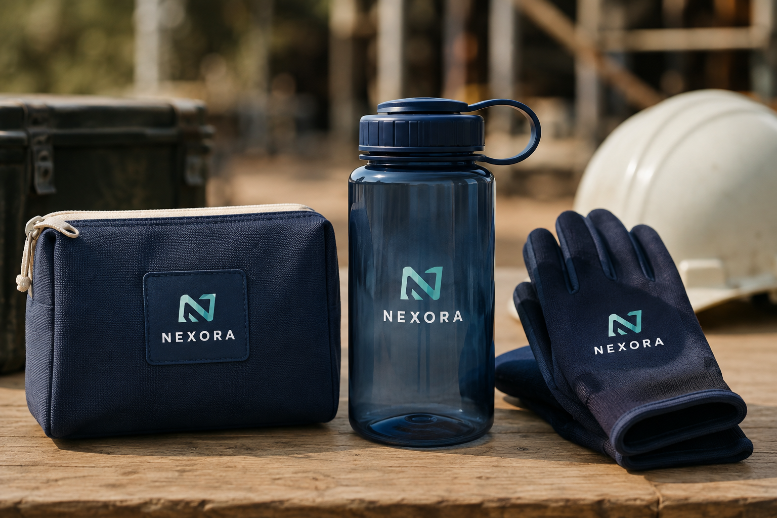
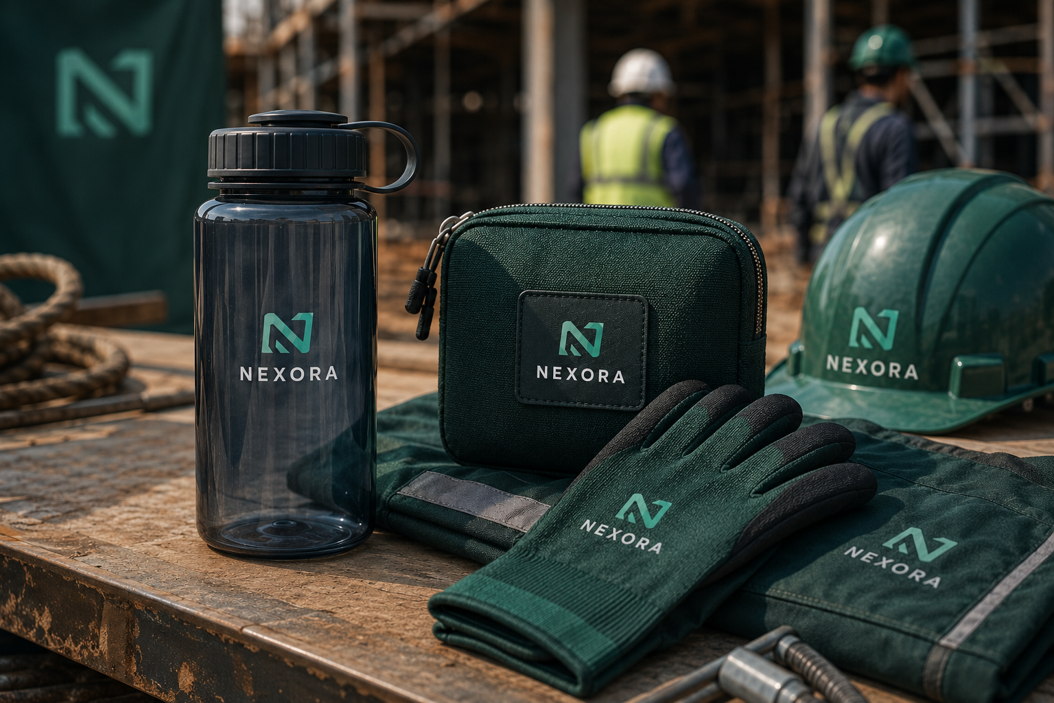
When the glove specification is right, it closes the loop on the coordinated product set. The pouch, the bottle, and the gloves are three different products serving three different functional purposes but in the same colour palette, with the same logo treatment, they read as a single visual system. That coherence is what makes the difference between a collection of branded items and a considered brand expression.
How Consistent Colour and Logo Placement Make Three Products Feel Connected
The principle at work across these three products is straightforward: visual consistency creates the impression of intentionality, and intentionality creates trust.
When a field team member carries a canvas pouch, a Tritan bottle, and wears gloves all in the same company colour, all with the logo in a consistent position and treatment the combination communicates that someone made deliberate choices. The brand didn't just appear on these products. It was placed there, with care, in a way that makes the products feel like they belong together.
This does not require the products to be identical in material or construction. A canvas pouch, a plastic bottle, and a fabric glove are made from entirely different materials and produced by different manufacturing processes. What connects them visually is colour matching across substrates achieving the same brand colour on canvas, on Tritan plastic, and on glove fabric requires specific attention at the specification stage, because the same Pantone reference renders differently on different materials and consistent logo treatment: same position, same relative scale, same application method where the material allows.
The practical requirement this creates is a brand colour specification that accounts for material variation. A Pantone reference provides the starting point, but the target colour on canvas may need a slightly different ink formulation than the target on plastic, and embroidery thread matching requires its own reference system. Getting this right is the work that happens before production and it is the work that determines whether the three products look like they came from the same brief or like they were ordered separately and happened to use the same logo file.
Where This Concept Works
A coordinated three-product set built around a canvas pouch, a Tritan bottle, and branded safety gloves is appropriate across several common construction and trade brand contexts.
Team onboarding is the most natural application. New hires should feel like part of the team the moment they step onto the site. A pre-packed welcome kit ready for their first morning instantly professionalises the onboarding process. A coordinated product set that includes functional items the new team member will actually use communicates something specific: that the company invests in its people from the first day, and that it has thought about what working for this company looks and feels like.
Project launches benefit from the same principle applied outward rather than inward a product set given to the project crew at mobilisation creates a consistent visual identity across the site from the first day of work, before the signage goes up and before the vehicles are branded. It is an early, practical statement of how the company operates.
Crew appreciation at project milestones is a context where the quality of the product matters more than the quantity. A well-specified, coordinated set given to a crew that has reached a significant project milestone communicates recognition in a form that the recipient uses and keeps, rather than a gift that is appreciated once and forgotten.
Trade events and construction industry conferences create client-facing brand moments where the company's merchandise represents its standards as much as any presentation or conversation does. A coordinated, practical product set says something different than a generic branded pen or a single-use tote bag.
How to Photograph These Products So They Feel Active, Not Catalogued
The visual direction for a product set like this matters as much as the product specification. A flat lay on a white background communicates the products clearly but says nothing about how they are used or why they matter. The brief for a featured image on a blog, a social post, or a campaign asset should push toward something more active.
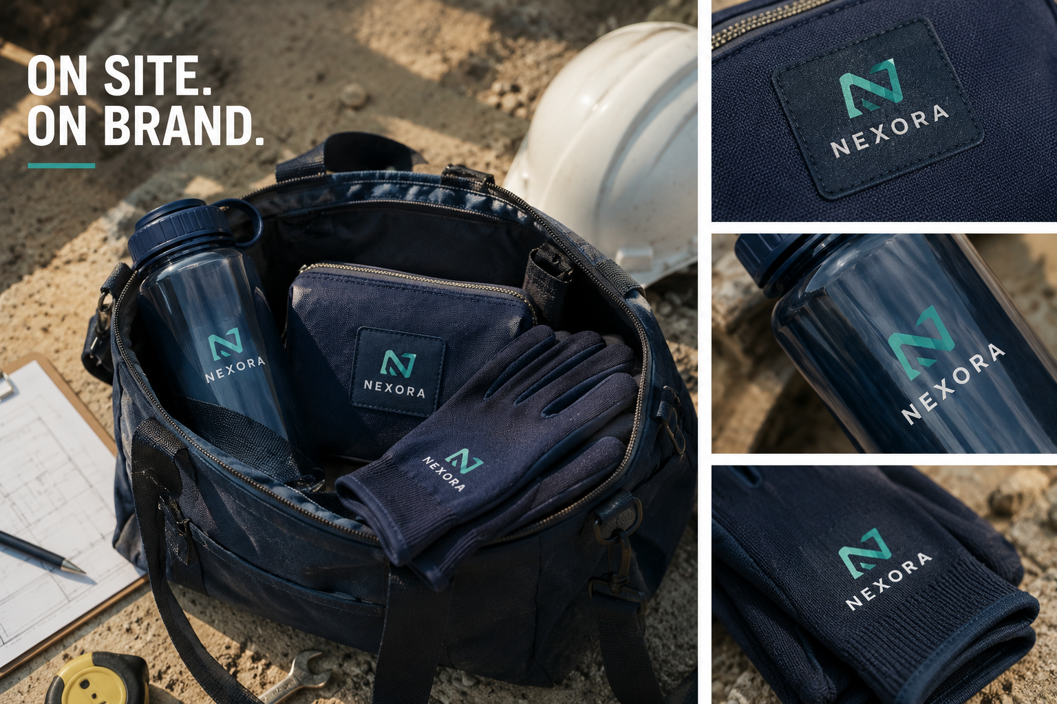
An overhead shot of a worksite bag open, with the pouch visible inside, the bottle in the side pocket, the gloves resting on top in a consistent brand colourway, photographed in natural or site-adjacent light, communicates the product set in its working context. It shows the products as part of a working day rather than as objects to be examined. The headline 'ON SITE. ON BRAND.' placed in one corner in a clean typeface completes the image without overcomplicating it.
Close-up detail shots: the embroidered logo on the pouch, the pad-printed label on the bottle, the cuff stitching on the glove serve a different purpose: they demonstrate the quality of execution to a sourcing-aware audience who wants to know that the specification was taken seriously. These work well as secondary images in a blog layout or as carousel content on social platforms.
The visual standard to aim for is editorial rather than commercial. The products should look like they belong in a working environment, not on a product page. That distinction shapes how the photography is set up, what surfaces and backgrounds are used, and how much of the surrounding context is allowed into the frame.
Practical Merchandise Extends Brand Presence Beyond the Obvious Surfaces
A company's brand lives in its office fit-out, its vehicle livery, its workwear, and its site signage. These are the obvious surfaces large, consistent, and largely stationary. They do their job well in the contexts they occupy.
Practical branded merchandise extends brand presence into the spaces and moments those surfaces don't reach. The commute. The client walkthrough. The break. The project debrief. The moments between tasks where a person reaches for a bottle, unzips a pouch, or pulls on a glove and the company's brand is right there, because someone made a considered decision to put it there.
That decision doesn't require a large budget or a complex brief. It requires the right products, specified correctly, in a consistent visual language that makes three separate items feel like they belong to the same story.
Ready to extend your brand into the working day? Share your colours, quantities and timeline with SWAI, and we'll help you build a coordinated product set that represents your brand as well on site as it does in the office.
Send us your brief colours, quantities, timeline and we'll advise on the most suitable product options and specification for your team.
SourceWithAI.com helps brands source smarter from China with verified suppliers, considered product thinking, and the sourcing judgement that turns a brief into something worth carrying.
Written by
Admin
August 14, 2026 · 10 min read